Need scroll bars and buttons to make your site make sense? Not according to Lee Brenner, Principal designer for thirteen 23 in Austin Texas.

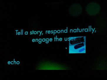
Brenner is challenging software designers and developers to create intuitive user interface constructs to not just guide the user through buttons that act as stop and go signs but, rather, enveloping concepts commonly used in the film industry that leads the user through the site like a story with a begging, middle and end. “Rather then using a button or a list make the content the UI.”, Brenner said. He wants the UI to be organic and intuitive.

Brenner admits that some users so accustomed to using buttons and scroll bars in the past find it odd to encounter software without them but he reassures them that after some use they’ll wonder why they ever needed them in the first place. To see some of his work check out his company’s site and Eric’s video in another post.
